Branding
Networking brand identity
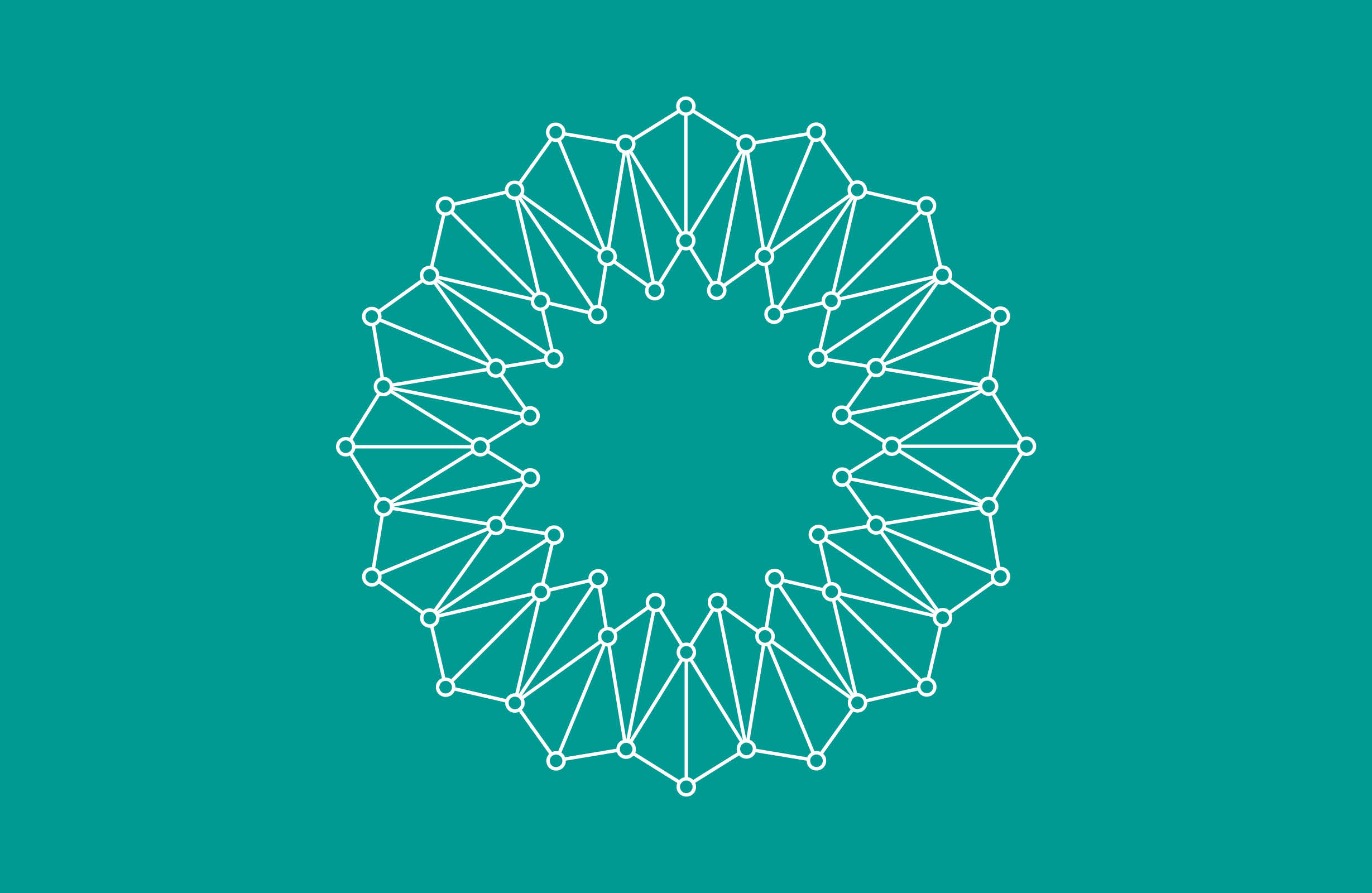
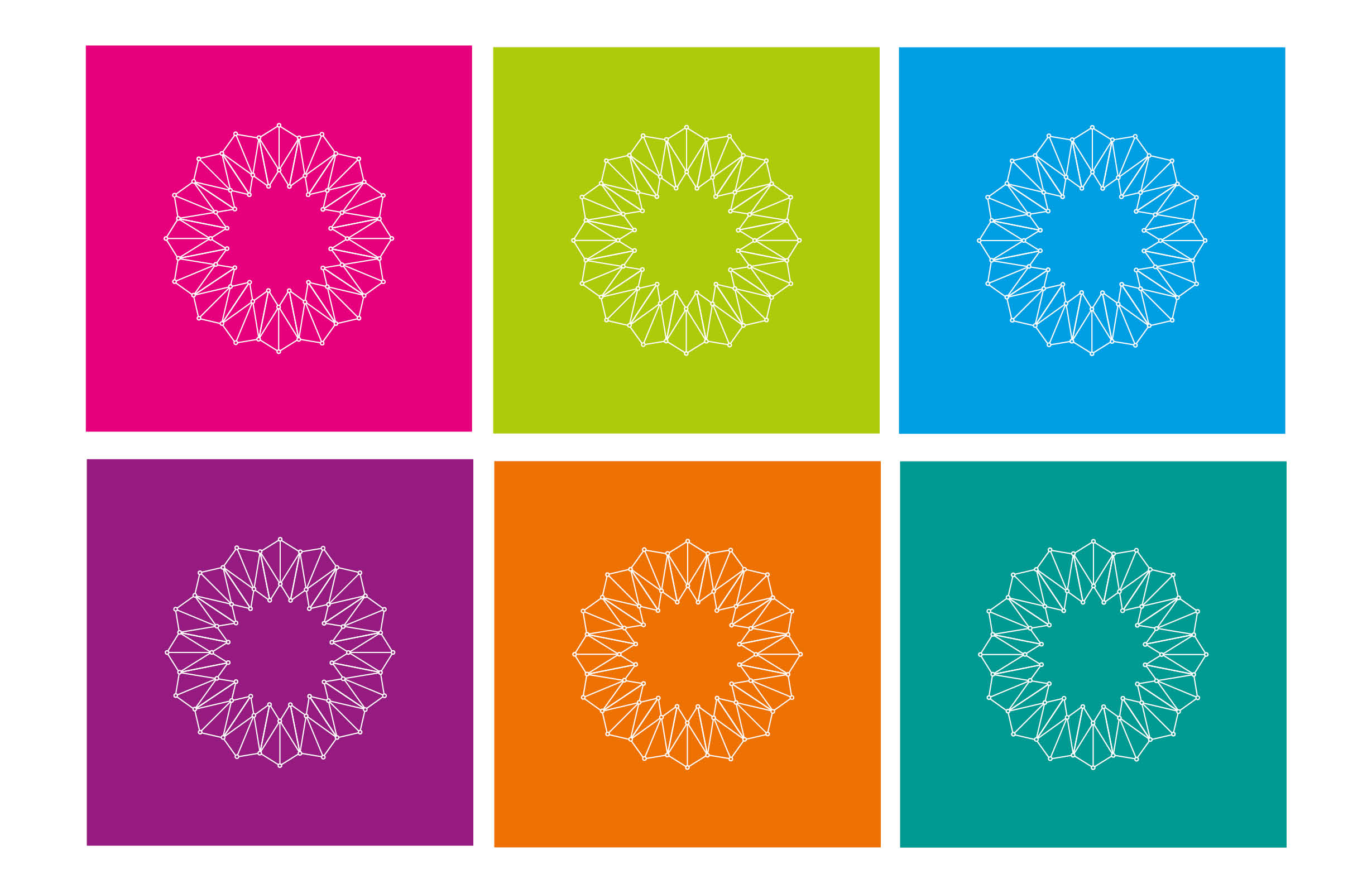
Our brief for this project was to create a unique identity that could be used in different regions for the clients networking groups. Therefore the identity had to reflect a feel for networking and growth. We delivered a logo that resembled networking with the simple dots and lines joining together forming an impression of a flower to represent growth.
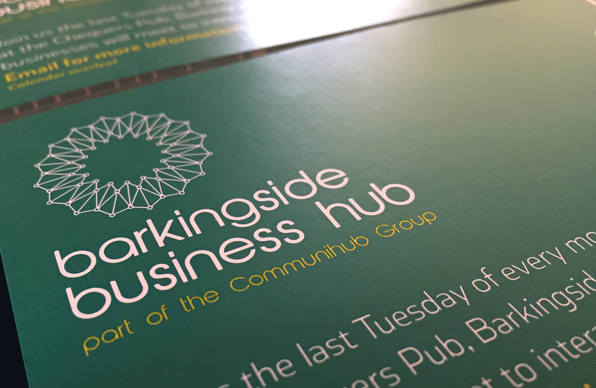
The logo with its unique identity can be used throughout various regions, each group having their own colour scheme.